

by Peter F.
Looking to add flair and panache to your writing? Flourishing is a fantastic way to inject personality into any word or phrase. I use flourishes whenever I address a friend’s name on a birthday or holiday card, and you can too!
All you will need is a pencil to draft your flourishes and a brush pen to draw them. You can find both of these in the Calligraphy Kit in Ignite Studio’s kit library. For a basic introduction to calligraphy, visit our blog post “Modern Calligraphy Basics.”
What are flourishes?
Flourishes are ornamental strokes that embellish words. They are often long, elegant, winding curves that extend the basic forms of a letter. By adding a flourish, you can transform a word from basic, normal text to something spectacular and eye-catching.
Where to Add Flourishes
After you write a word, look for places where you can attach flourishes. Easy attachment points are the ascenders and descenders of lowercase letters like b, f, g, or p. Other possibilities are the crossbar on a t, or the beginning and end of a word. If there are no good attachment points, you can add free-standing flourishes that don’t connect at all!
What Flourishes to Add
It can be daunting to decide what flourishes to put in your writing. So here are 3 types of flourishing families you can practice: simple ovals, pretzels, and figure eights. Memorizing these will make it easy to embellish your writing; instead of drawing curves aimlessly, you have simple blocks that you can add together to make complicated structures.
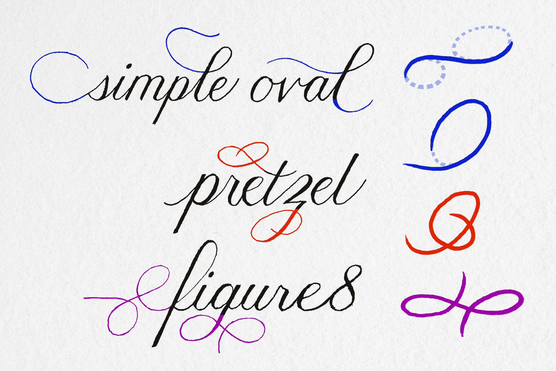
The header image of this blog post contains all 3 of these flourishing families. Take a look and see how they’re incorporated!
Guidelines
There are three important guidelines to keep in mind whenever you flourish:
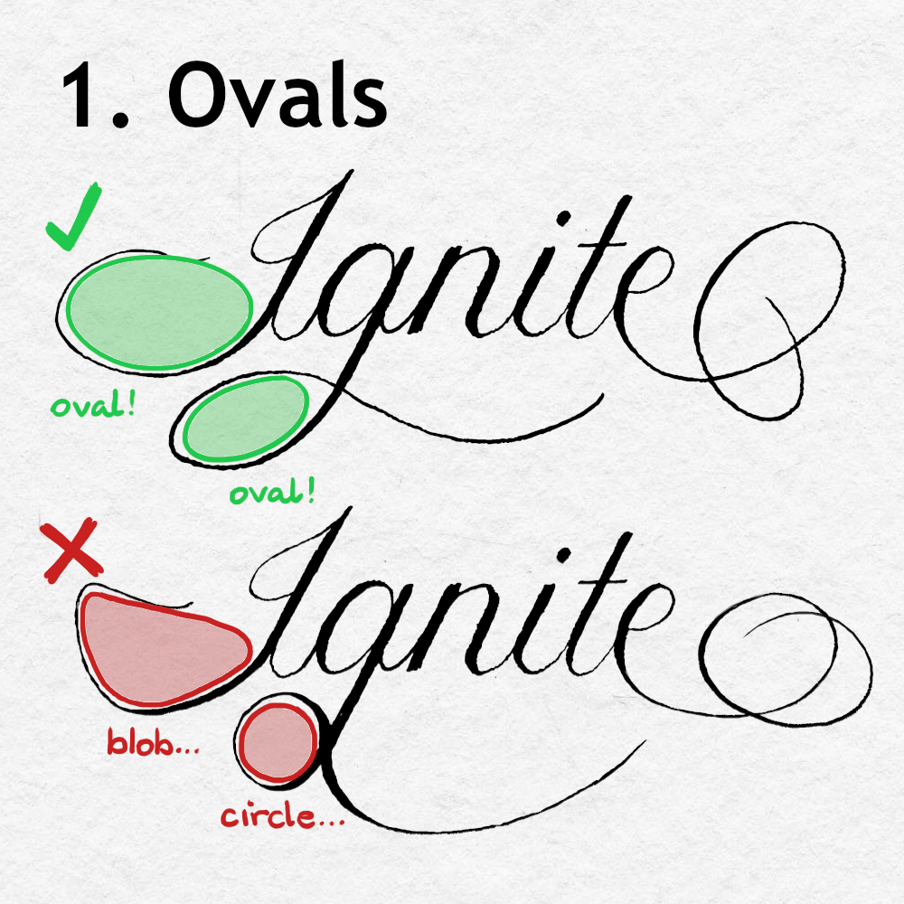
- The oval is the fundamental shape of flourishing. Basing your curves on ovals (rather than circles) will unify them with the natural shape of the letterforms and provide a sense of elegance. If you would like to learn more about the oval, check out this article by The Flourish Club.
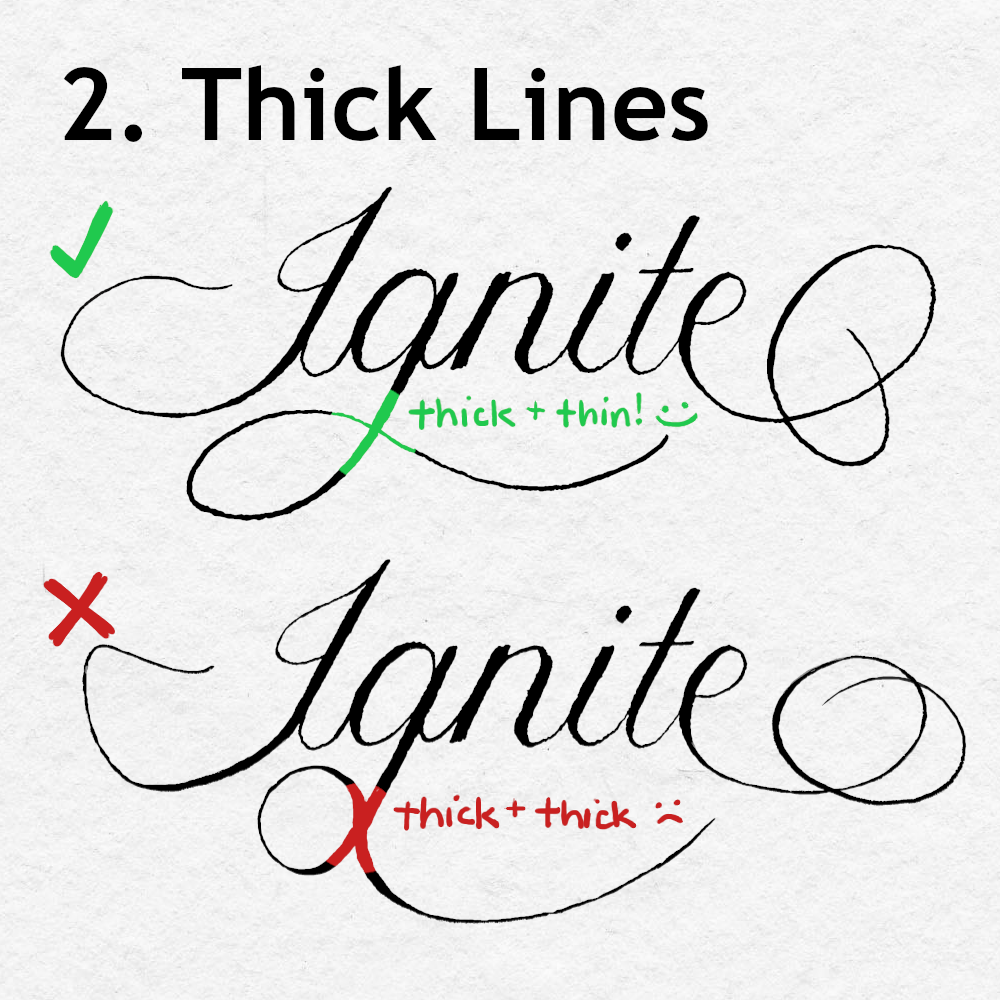
- Never cross two thick lines. Whenever two lines cross, at least one must be thin. If two thick lines were to intersect, they’d create a focal point that would draw too much attention. This is important to remember if you choose to decorate the crossbar on a t. The brush pens inside Ignite’s Calligraphy Kit have two sides: a brush tip, and a fine point tip. You can draw lines with the fine point to ensure that they are thin.
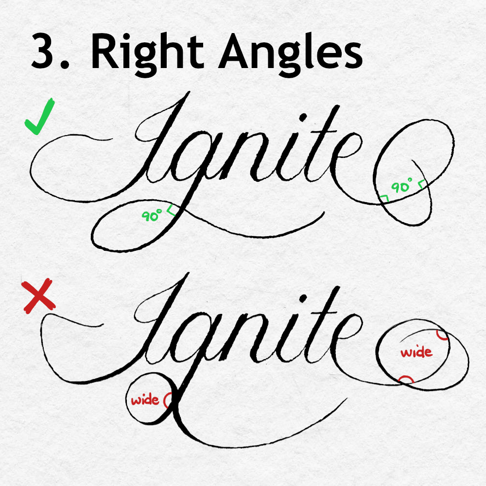
- Keep intersections perpendicular. Whenever two lines cross, give them structure by making them cross at a 90 degree angle, or as close as you can to that. Otherwise, they may look bunched up, unbalanced, or tangled.
Great job taking the time to learn more about this classic skill. Now that you know the fundamentals of flourishing, I hope you feel empowered to add it to everything! Feel free to share anything you make on the Ignite Studio Discussion Board on Facebook.
If you’d like to level up your calligraphy skills even more, check out our other blogs on calligraphy, and look out for calligraphy-related workshops on our event page!