by Jared H.
Modern Calligraphy Basics
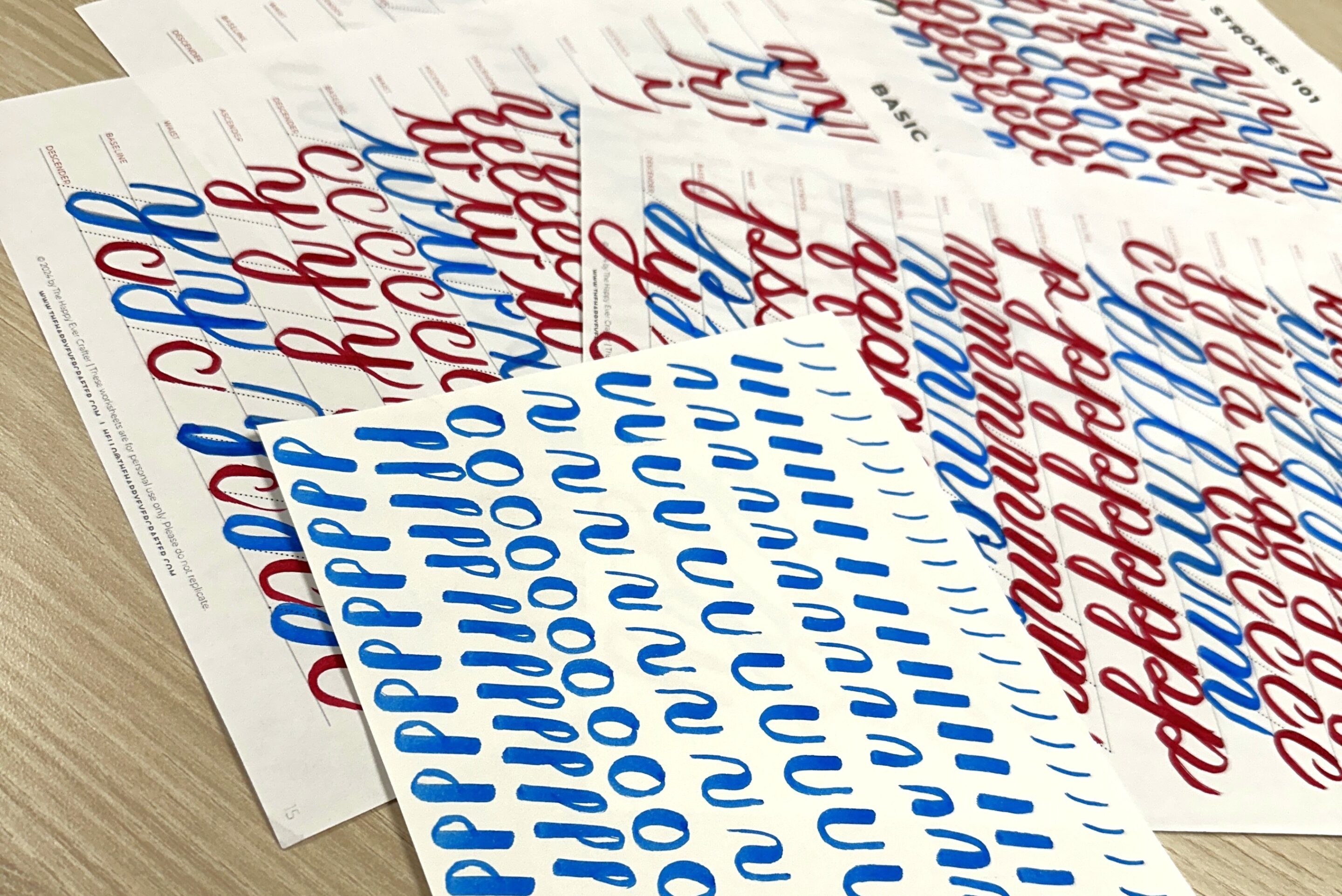
I recently took a free online course on modern calligraphy by The Happy Ever Crafter. This course provides a workbook to print out as well as videos to follow along with. All you need to get started is a brush pen. If you don’t already have one, we provide some in our Calligraphy Kit here in Ignite. I’ve always been impressed with hand-lettering. I had watched a lot of videos in the past, but I never had the patience to really practice and learn the skill. This course broke it down in a way that made a lot more sense to me. It will still take a lot of practice, but now I feel like I know how to practice. I’ll share one of the tips that helped me the most through this course. It may be enough for you to feel more confident getting started, but I would encourage you to check out the full course HERE.
With the full free course, here’s what you can expect to find through the workbook and provided videos:
- Choosing the right pens
- Warmup
- Before & After Assessment
- Correct way to hold your brush pens
- Basic Strokes
- Basic Letters (explanation of how the basic strokes combine to create letters)
- Explanation of connections between letters
Thick vs Thin Strokes
This is a basic, but very important rule. Anytime the pen is moving in an upward motion, the mark should be light and thin. Alternatively, anytime the pen is moving through a downward stroke the brush mark should be thick. Take your time with each mark and try to adjust your pressure to match the direction of your stroke path.
Basic Strokes of Modern Calligraphy
The biggest thing that helped me in this course was how it taught the basic strokes. In a sense, this is just the pre-alphabet. Using different combinations of these eight strokes will create the majority of the letters. Seeing the letters broken down this way really helped me learn the structure of each letter before learning the letter as a whole. This is the step I feel most instructional videos I have watched left out.

Upstroke: The lightest stroke.
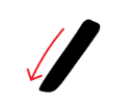
Downstroke: The heaviest stroke.
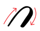
Overturn Stroke: Keep the sides parallel.
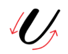
Underturn Stroke: Keep the sides parallel.
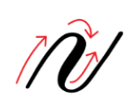
Compound Curve: Keep all three sides parallel.

Oval: Starts at the top-right, not the top-center.

Ascending Loop: Used for many letters that extend above the x-height (for example: b, d, h, and k).
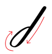
Descending Loop: Used for many letters that extend below the x-height (for example: g, j, p, and q).
Assembling Letters
These eight strokes then get combined to make various letters. For example, the formula for the letter “g” is: Upstroke + Oval + Descending Loop + Upstroke

The letter “g” broken down into the basic strokes needed to assemble the letter.
I quickly discovered that repeatedly practicing these 8 strokes makes a huge difference in what I felt capable of. I hope this encourages you to give modern calligraphy a chance! Check out our other blogs on calligraphy to see more possibilities, and help inspire others by sharing your creations on the Ignite Community Discussion Board. Happy Making!

