by Jared H.
Riso printing is a fun method of printmaking that makes eco-friendly prints with a vintage aesthetic. It can be used for artwork done by hand (analog), or for digitally created files. Check out our Introducing the Risograph blog which discusses what the Riso is and how to get started using it in our space if you’re unfamiliar with it. If you prepare digital files for the Risograph, you will need to know how to get your artwork ready for printing. In this blog, I will discuss some of the steps I take when prepping my own files for printing. Hopefully this helps you prepare to print your own files too.
Color Separation Options
Risograph prints are a color separated process, much like silk screen printing. We call the machine a printer, but it is more accurately a “stencil duplicator.” The Riso uses your digital art to create a stencil (also called a “master”) which is wrapped around a color ink drum that creates the prints. The color ink drum you put into the Riso determines the color of the print. The Riso can only understand the values of files, not color, to make the masters. Therefore, our digital artwork needs to be color separated (so we can print each color one at a time) and in grayscale (so the Riso understands how to make the stencil correctly). To create color-separated grayscale files, you can do either of these two methods:
- Let Spectrolite create the files for you – This beginner-friendly app does the hard work for you.
- Manually prepping files – Requires strict layer management, but gives you more control.
Which one you use will be up to you and your workflow.
Riso Ink Colors
No matter which method you choose, it is good practice to import the correct hex codes into your design software. This will give you a reasonably accurate depiction of what the final print will look like. Colors do look different in-person since Riso ink colors are hard to duplicate, but it will at least give you a rough idea of what to expect.
Here are the six colors we have available as of Q3 2025.
- Black – #000000
- Fluorescent Pink – # FF48B0
- Crimson – #E45D50
- Sunflower – # FFB511
- Orchid – # BB76CF
- Cornflower – #62A8E5
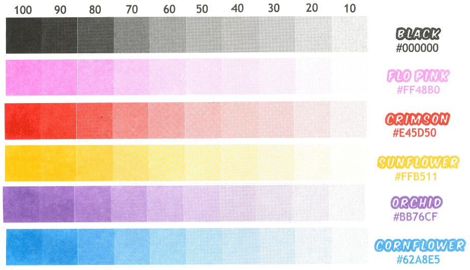
Display of Riso colors printed at various opacities.
Method 1: Use Spectrolite to Separate Colors
Let’s start by discussing the easier of the two options. If color separation seems overwhelming, this method uses the free Mac exclusive software Spectrolite to handle the color separations for you. Because it does the hard work of color separation automatically, you can illustrate however is most comfortable for you. We have this software available for you to use on our Mac station in the Riso Lab if you don’t have access to a Mac at home.
There are a couple downsides to using Spectrolite:
- You can only select up to 4 colors for your prints.
- It’s not 100% accurate when separating the colors. Even if you use the exact color hex codes while designing, you may still see trace amounts of an extra color you didn’t intend in the color separation. However, from my experience, it’s so subtle it’s not noticeable in the end.
Even with those flaws, the amount of time the app can save is substantial. If you’re doing a 4-color (or less) print and don’t want to deal with strict layer organization, then this is a good choice for you.
Here are the basic steps of creating the files in Spectrolite. A more in-depth explanation on Spectrolite and what it offers can be found on their website or you can learn more about it in our Riso Basics workshops.
Create a Color Palette
When you open Spectrolite, navigate to the “Palette” menu and click “New Palette.”
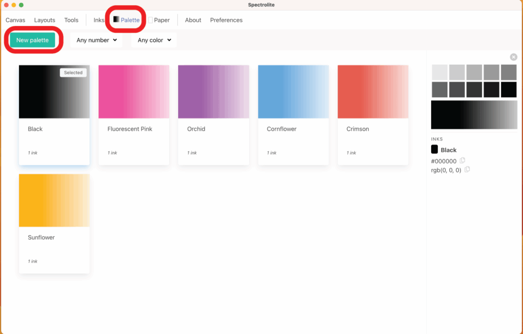
Select up to four colors for your print and click “Save.”
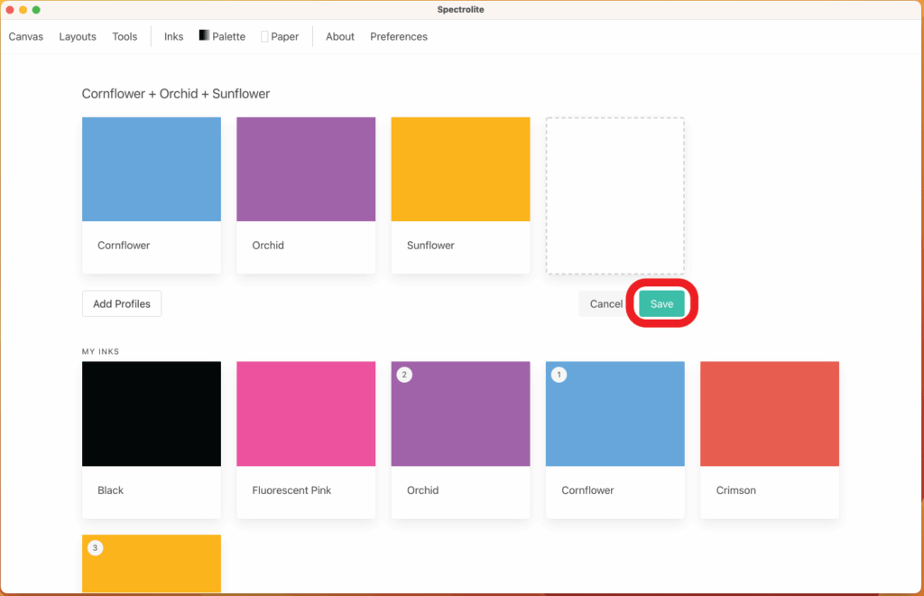
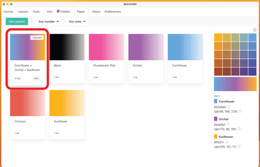
You’ll now see the newly created color palette. Make sure it has the “Selected” option in the top corner of the palette before proceeding.
Create the Master Files
Now that you have chosen a color palette, navigate to the canvas menu. Click inside the left rectangle to open your artwork file. Then click “RISO-ify” in the top right corner.

This will separate the file into the color channels chosen in the palette menu as well as create a preview image. If you illustrated the file using only the colors chosen in your palette, then the preview will look nearly identical to your original file. After separating the colors, click “Export” in the top right corner.
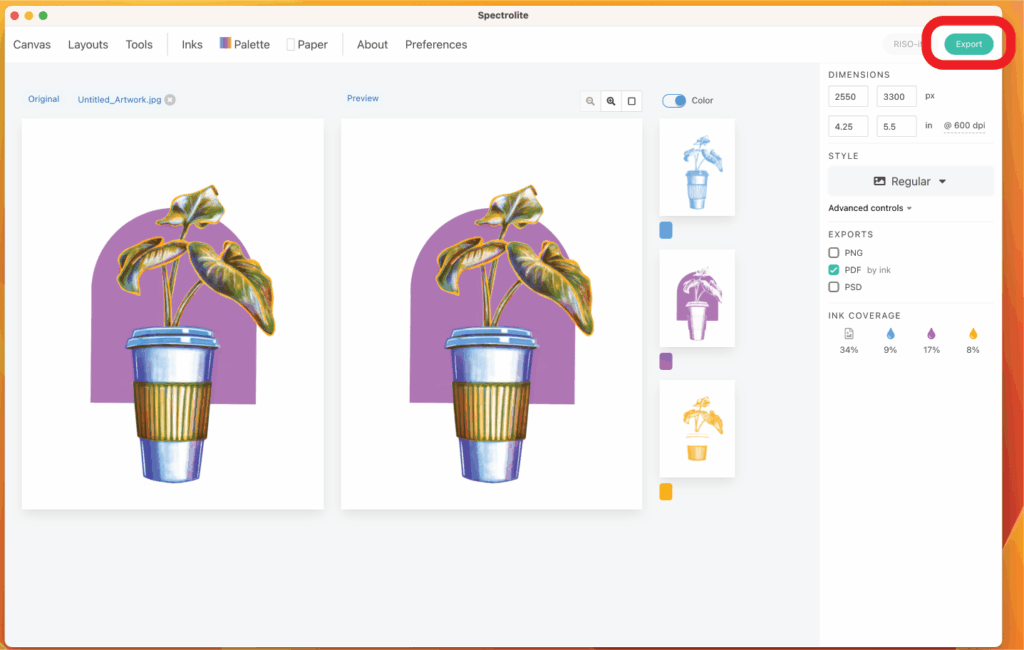
Exporting will produce the grayscale PDF files that you can use to create masters on the Riso.
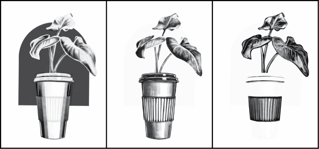
Spectrolite’s grayscale files for making masters. Left: Orchid; Middle: Cornflower; Right: Sunflower
Method 2: Use Procreate to Separate Colors Manually
Working this way can be more challenging and requires some strict layer organization, but it gives you greater control over where and how much color is placed. My instructions will be based in the iPad software Procreate. This software is available to use within Ignite by checking out an iPad at the service desk. Alternatively, these steps can be followed using Adobe Photoshop (also available on the Mac in our Riso Lab).
When you create your file, you will make one layer per ink color. I highly recommend naming the layers after their color to reduce confusion.
Make sure you are drawing on a transparent background, not on a layer filled with white. If you make this mistake, you will have big problems when it comes to finalizing your files later. It will force you to either restart or use Spectrolite. Instead, create a separate layer and fill it with your intended paper color.
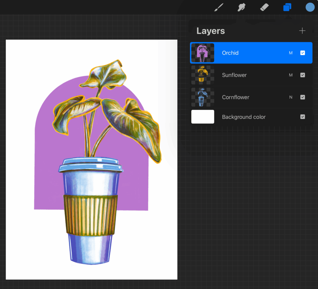
Screenshot displaying proper layer organization.
While designing, make sure you are only coloring with the designated color for each layer.
To get your digital application to replicate the color mixing that will occur when Riso inks are layered, change the layer style to multiply for each of the layers. This is by no means perfect, but it does a pretty good job at giving a general idea of how things will look.

Screenshot highlighting how to adjust the layer style to “multiply”.
Increase Color Variety with Additional Layers
I recently read through Natalie Andrewson’s book “Dreaming in Color.” She explains that in her workflow she uses 4 layers per color. She always draws with a 100% opaque brush but reduces the opacity of the layers to increase color variety. For example, four different layers of Cornflower to represent:
- 100% Cornflower Layer Opacity
- 75% Cornflower Layer Opacity
- 50% Cornflower Layer Opacity
- 25% Cornflower Layer Opacity
This might be a useful way for you to increase your color variety too.
Converting to Grayscale
Once you’ve finished illustrating, merge all of the like-color layers together if you have done as advised above. This should leave you with only one layer per Riso ink color you intend on using. The final step is to adjust the lightness of each layer. Use the “Brightness/Saturation” layer adjustments to reduce the brightness of each layer to 0.
IMPORTANT NOTE: This is not the same as reducing the saturation. Saturation should be left as-is.
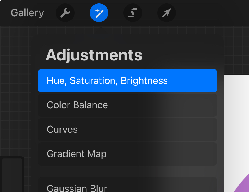
Screenshot highlighting where to find the “Hue, Saturation, Brightness” layer properties.
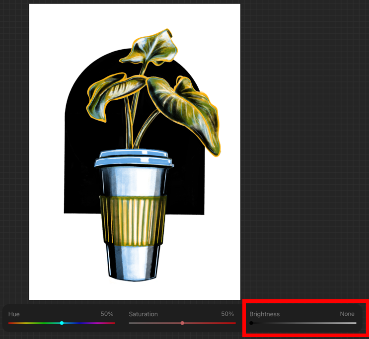
Brightness being reduced to zero.
After you adjust the brightness of each layer, export each layer individually so your artwork will be a grayscale image on a solid white background. These are the final files you’ll send to the Risograph to create masters.
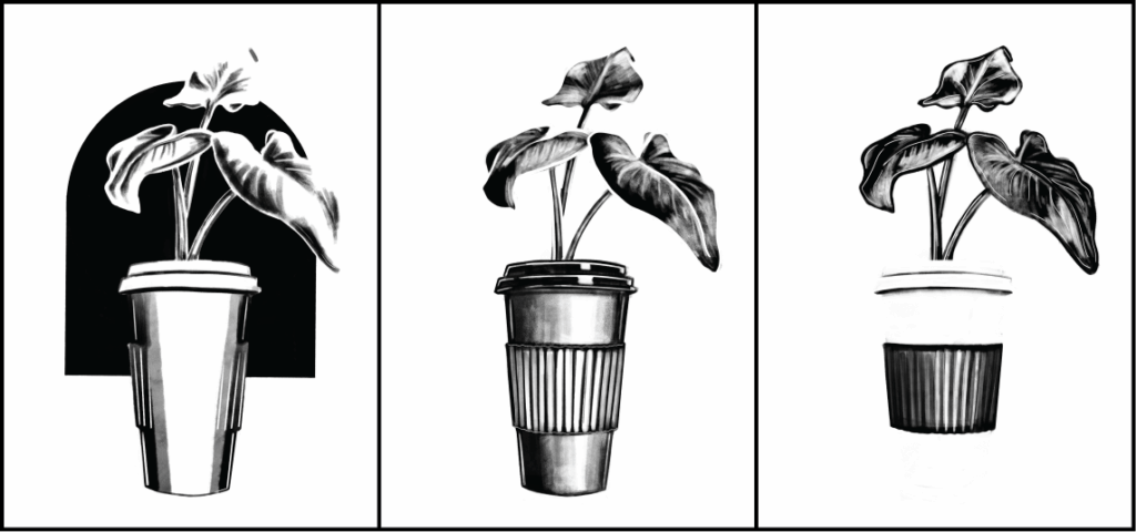
Manually making the grayscale files for making masters. Left: Orchid; Middle: Cornflower; Right: Sunflower.
Before you get started using the Riso, you will need to go through one of our monthly Riso Basics workshops or schedule a 1-on-1 training appointment by emailing [email protected]. After you go through either the workshop or the training, you will be able to use these tips to make digital Riso prints!
Post your Riso prints to the Ignite Community Discussion Board on Facebook or tag the library @hamiltoneastpl on Instagram or Facebook. Happy Printing!

