By Kris Hurst
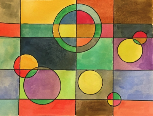
Optical illusions have a way of tricking us into seeing something other than what is right in front of us. This can be done through the use of color, hue (shades of a color), patterns, and line. Artists can “fool” us by creating images on flat surfaces that make us see 3-dimensional pieces simply through the use of pencil marks. When studying, artists learn that cool colors such as blue, green, and purple tend to recede while warm colors like yellow, orange, and red appear to come forward.
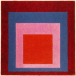
Joseph Albers, Homage to the Square, 1956
Op Art, or optical art, employs optical illusion. Joseph Albers, an innovator of Op Art, was a German-born artist who studied color and how we perceive and respond to it. In his series of paintings, Homage to the Square, Albers used colored squares “layered” onto each other to explore how colors influence each other and the viewer. The size of the squares, the amount of visible color, and the hues affect what stands out to the viewer as well as the overall mood of the painting.
Notice how the colors appear to be in competition with each other, each trying to reach the viewer most strongly and repeatedly. In reality, we know the canvas is a flat surface, but through marks and color choices, Albers has made his piece interactive, and we must decide what we are seeing.
Supplies needed:
- White paper
- Markers or crayons or watercolors
- Items to trace of different sizes and shapes: caps, lids, cans, etc.
- Pencil (optional)
Instructions:
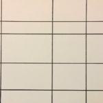
1. Draw a few horizontal lines and three to four vertical lines in any spacing of your choosing. If you prefer, you can do this first in pencil and then trace over it in marker or crayon.
2. Trace each of your different shapes onto the paper at random locations. Feel free to overlap shapes. You can choose all the same shape, like the example, or vary your shapes. Varying the sizes creates more interest.
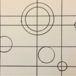
3. Add color to your outlined spaces. The trick is to alternate warm and cool colors. Do this until you have filled in all the divided shapes.
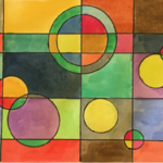
Now that you’ve finished your creation, what do you notice? Do some colors appear to come off the page? Do some appear to be in the background? Pick a color from your artwork: When you look at it next to other colors, does it appear different even though you know it’s the same?
Check out these optically engaging videos featuring Joseph Albers’ work:
Be sure to visit us each Monday morning at 9am for our virtual drop in!

